How to run your own 20-minute website audit
The same checklist I run before I ever quote a rebuild — five minutes each on performance, mobile, findability, and conversion paths.
How to Run Your Own 20-Minute Website Audit
Before I quote anyone a rebuild, I run their current site through the same checks, in the same order, every time — grouped into four pillars: performance, mobile, findability, and conversion paths. None of it needs a developer, and none of it needs a paid tool. Twenty minutes, a phone, and a laptop is enough to know whether your site is actually working for you — or just sitting there.
Here’s the exact checklist. Grab a coffee and run it on your own site as you read.
How to use this Each pillar takes 3-5 minutes. Do them in order — conversion paths comes last deliberately, since it’s the sum of everything a visitor experiences before they act, not a separate concern from it.
Pillar 1: Performance (3 minutes)
Run your homepage through PageSpeed Insights — free, no signup, just paste your URL.
Ask yourself:
- Is the mobile score above 70? Below 50 is a real problem.
- What’s flagged as the biggest issue — usually images or unused JavaScript?
Why it matters: every second of load time past 3 seconds measurably increases the chance a visitor leaves before the page even finishes loading — and Google factors load speed into search ranking directly.
A real example — this site, mid-audit
I ran this exact check on this site while writing this post, and got a 69 on mobile. Not a disaster, but not the pass I’d want to show a client either.
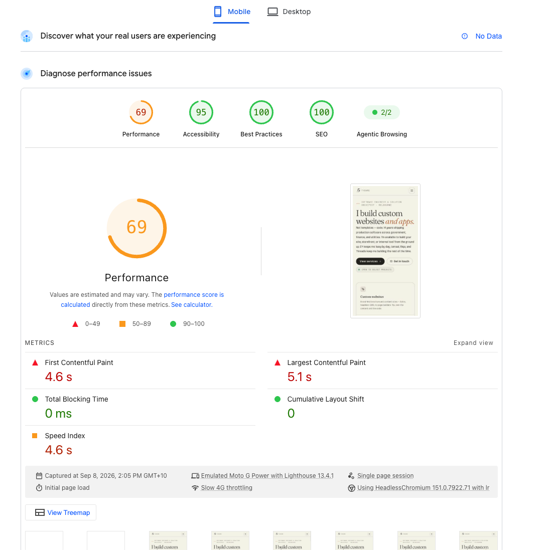
Fixed it, then re-ran the same test:
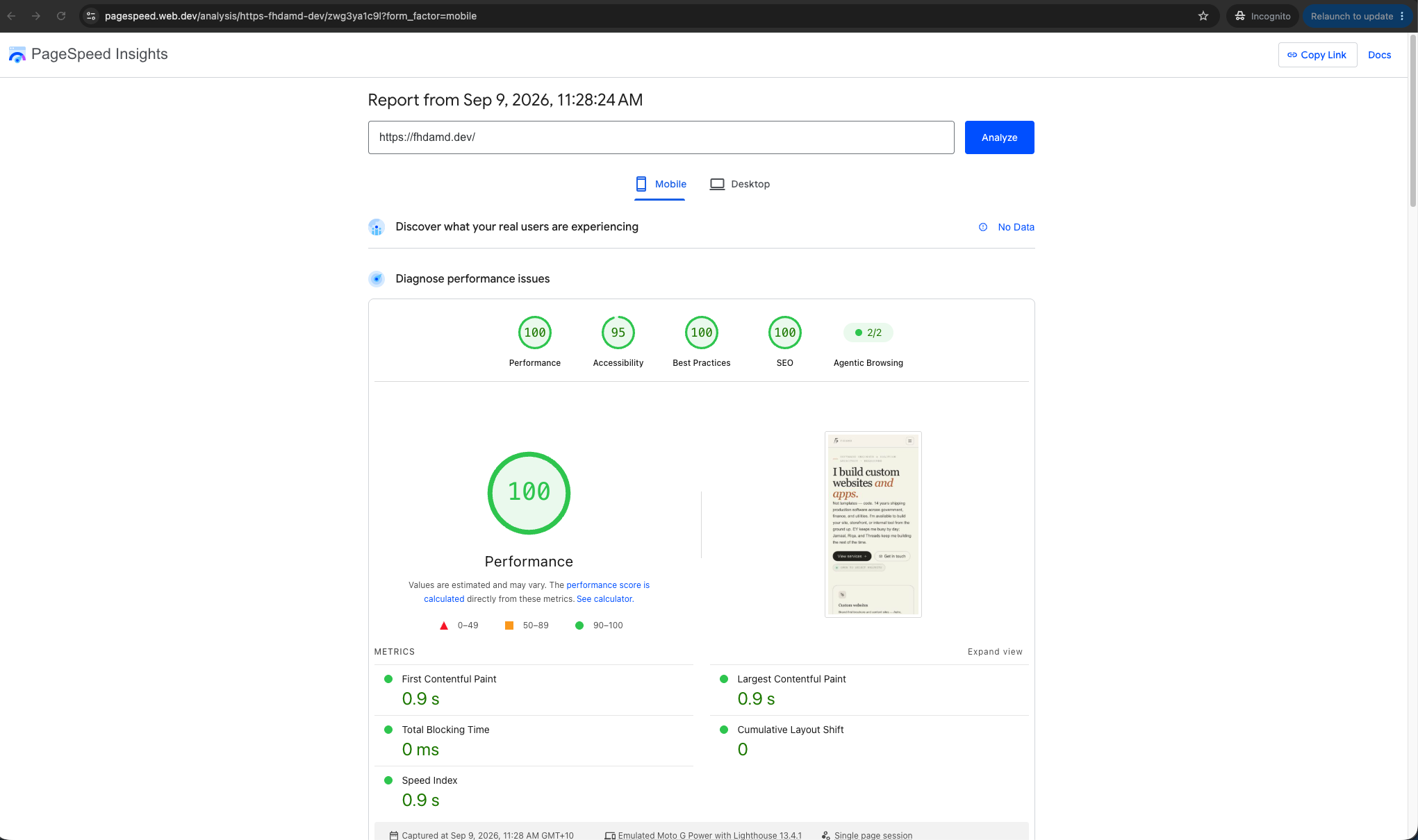
| Before | After | |
|---|---|---|
| Performance score | 69 | 100 |
| First Contentful Paint | 4.6s | 0.9s |
| Largest Contentful Paint | 5.1s | 0.9s |
| Speed Index | 4.6s | 0.9s |
| Cumulative Layout Shift | 0.067 | 0 |
What actually changed, in plain terms:
- The site’s shared stylesheet was being requested as a separate, render-blocking file — switched Astro’s build config to inline it directly into the page HTML instead, so the first paint doesn’t wait on a separate download.
- Analytics tracking (Google Tag Manager) was downloading and running during the initial load window — deferred it to load only after the page has loaded and the visitor interacts, since a visitor doesn’t need analytics to see your homepage.
- The site’s interactive header component was hydrating immediately on load — changed it to hydrate only once the browser is idle, so it’s no longer competing for attention during the critical first second.
- Custom fonts were being aggressively pre-loaded ahead of everything else — now they load in after the page has loaded (or on first interaction), with the visitor’s system font shown immediately so text is never invisible while waiting.
- Fonts are now set to
display=optional, meaning if the custom font hasn’t loaded in time, the page just keeps the fallback rather than swapping fonts later and causing a visible jump — that’s the layout shift going from 0.067 to a clean 0.
None of this touched a single word of visible content or design — it’s entirely about when things load, not what loads. That’s usually where the easiest, highest-impact speed wins are hiding on any site.
Worth noting: even after the fix, PageSpeed still flags around 11KB of unused CSS and 49KB of unused JavaScript, plus a couple of accessibility contrast warnings (hence 95, not 100, on Accessibility). None of that is blocking anything — it’s the next round of polish, not an urgent fix. Speed work is rarely “done,” just progressively better.
Pillar 2: Mobile (3 minutes)
Load the site on your actual phone — not a resized browser window. More than half your visitors are almost certainly on mobile.
Ask yourself:
- Does this feel like it was designed for mobile, or just shrunk down from desktop?
- Can I tap every button comfortably with a thumb, or do I keep mis-tapping?
- Does the main call-to-action stay easy to find as I scroll?
What good looks like:

If your own mobile view has tiny nav links, overflowing text, or fields that are fiddly to tap — that’s the gap worth fixing before anything else on this list.
Pillar 3: Findability (5 minutes)
Can someone who doesn’t already know you actually find you — and does what they find look current?
Basic SEO
Ask yourself:
- Google your business name plus your suburb. Do you show up on page one?
- Google your main service plus your suburb (e.g. “electrician Officer”). Do you show up at all?
- Right-click your homepage → View Page Source → search for
<title>. Is it your business name and nothing else, or does it actually describe what you do?
If you’d rather not read the source manually, SEO Meta Preview is a handy Chrome extension for this step: one click shows the title, meta description, canonical URL, robots tag, headings, and Open Graph preview.
What good looks like:
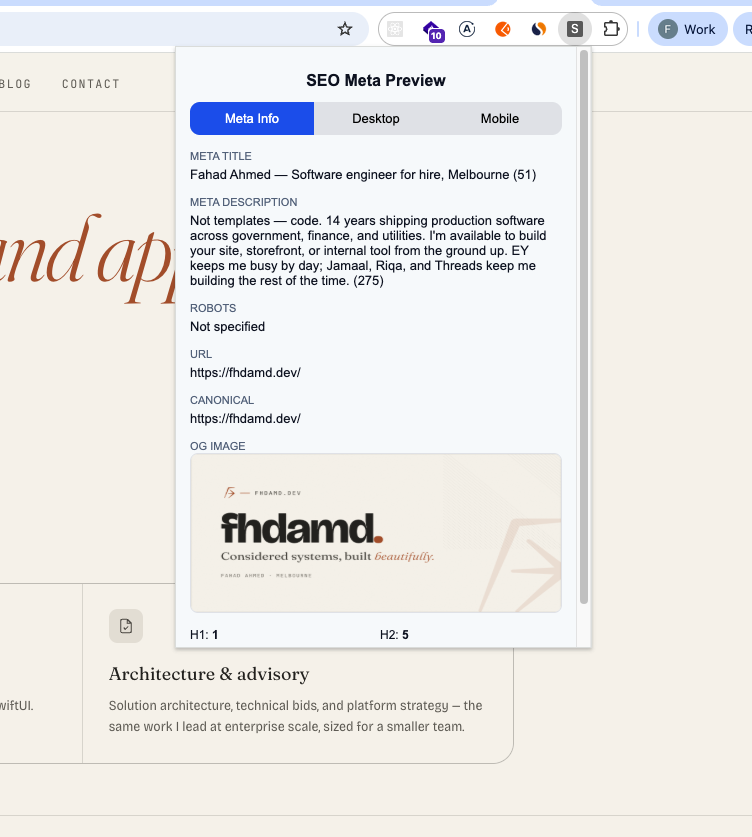
If you don’t show up searching your own business name plus suburb, that’s a gap worth fixing before anything fancier.
Content freshness
Ask yourself:
- When was this site last meaningfully updated? Check the blog, news, or projects section.
- Does it show your current services, pricing, and current work — or projects from three years ago?
- Is the copyright year in the footer current?
An outdated footer year is a small thing that quietly tells every visitor “nobody’s minded this in a while” — and Google’s own ranking signals favor sites that show real signs of life.
Pillar 4: Conversion paths (5-6 minutes)
This is the sum of everything above, seen through one question: once someone lands here, does the site actually help them become a customer?
First impressions
Open your homepage on a fresh tab, set a 5-second timer, and actually look at it like a stranger would.
Ask yourself:
- Can I tell what this business does within 5 seconds — no scrolling?
- Is there one clear next step visible without scrolling (call, quote, book, buy)?
- Would I know I’m in the right place if I searched for this exact service?
What good looks like:
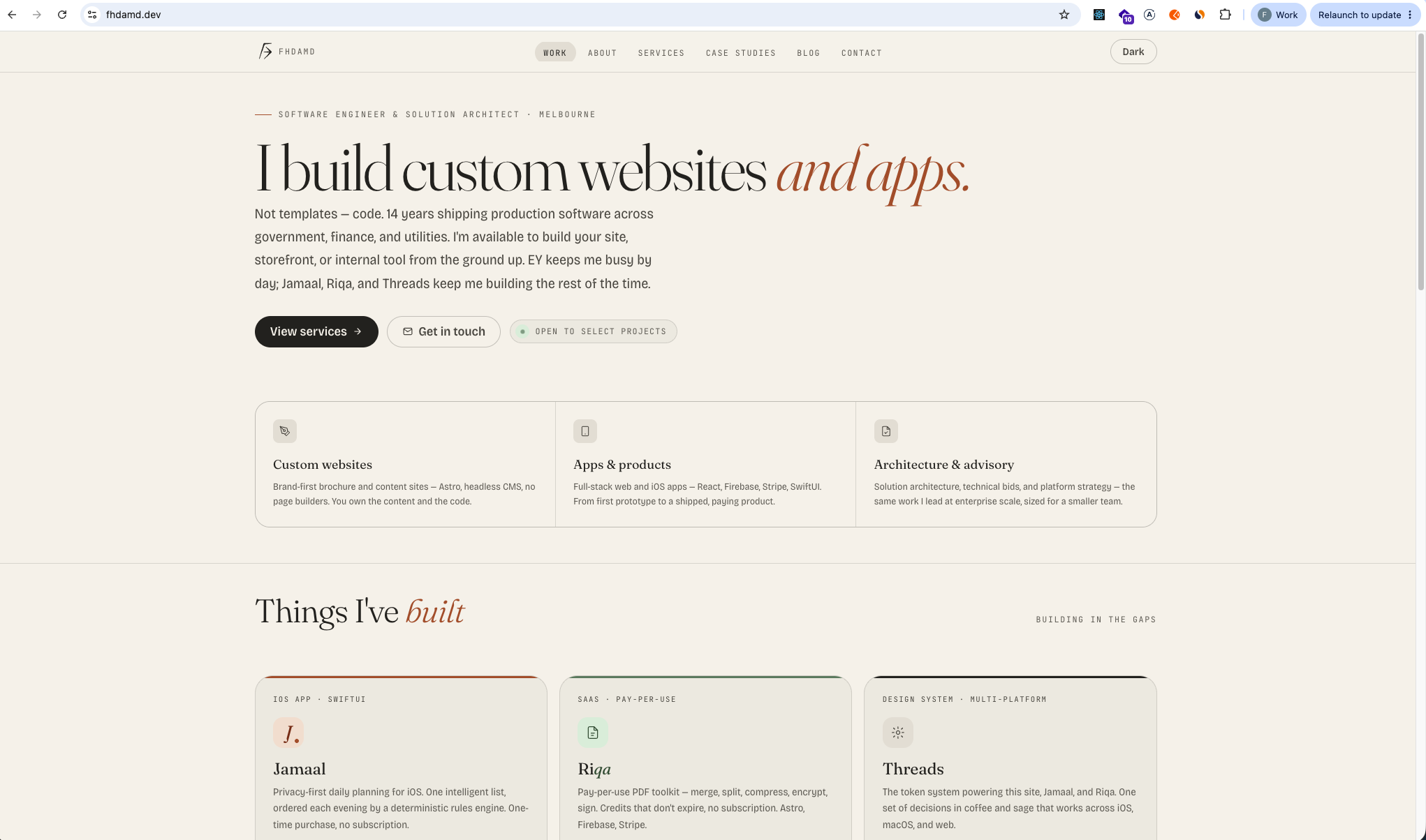
If you had to scroll on your own site, or you’re not sure a first-time visitor would know what to do next, that’s gap #1.
Lead capture
This is the step people skip, and it’s usually where the real money is lost.
Ask yourself:
- How many clicks does it take to get from the homepage to “contact us” or “get a quote”?
- Actually fill out the contact form yourself. Does it work? Do you get a confirmation?
- Is your phone number/email clickable on mobile, or just plain text someone has to copy manually?
What good looks like:
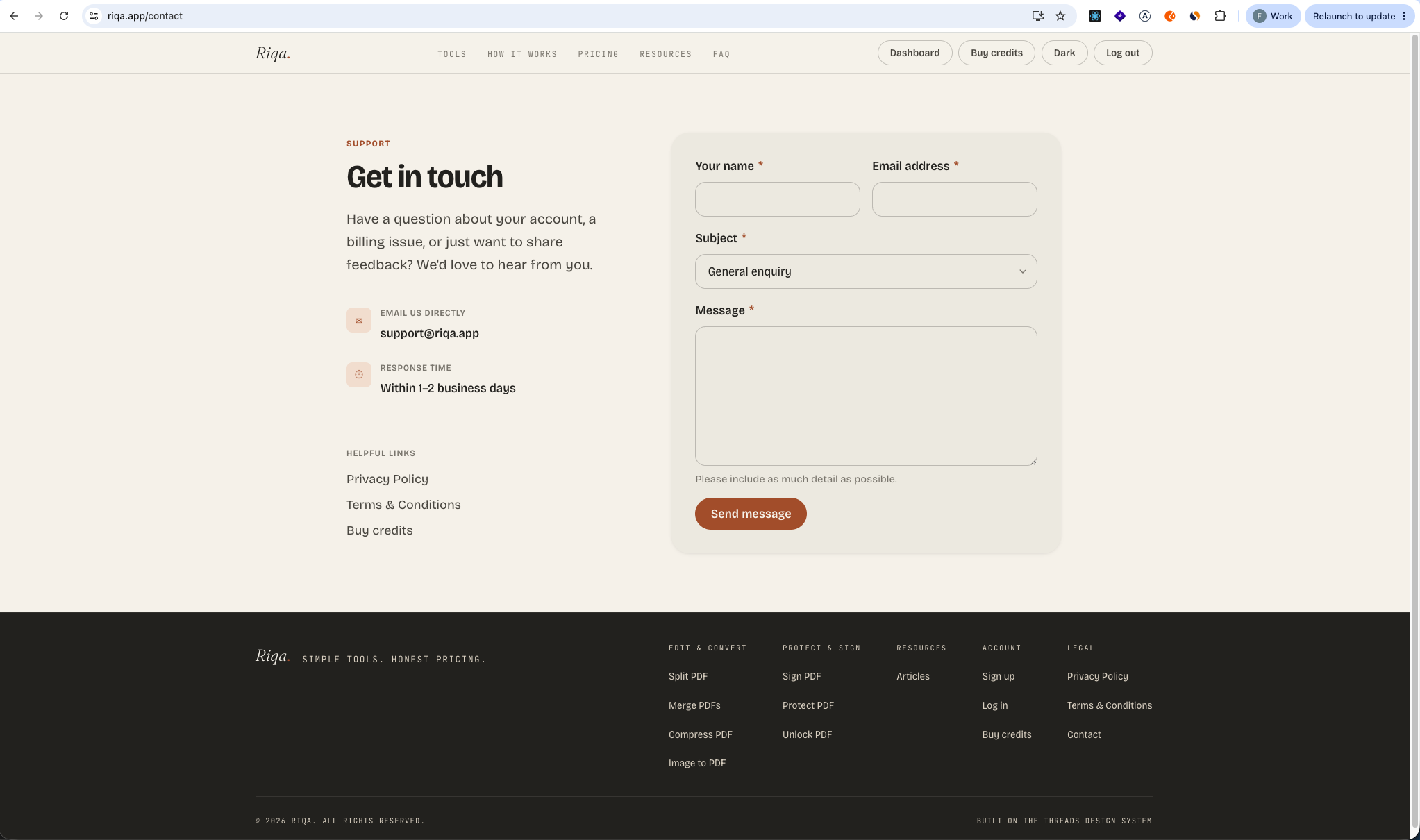
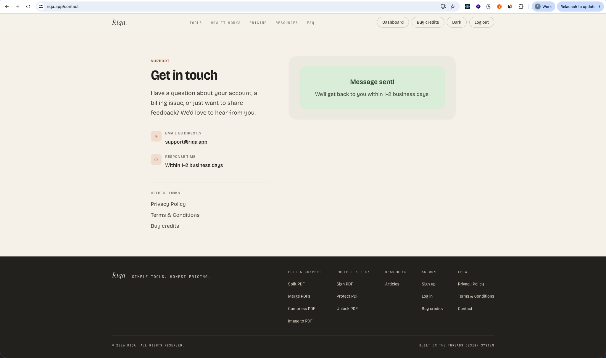
If your own form fails silently, or your phone number isn’t a tappable link on mobile, that’s usually the single costliest gap on this whole list. I’ve tested contact forms during real audits that simply didn’t send anywhere — the business had no idea.
Security & trust signals
Ask yourself:
- Does the address bar show a padlock (https, not http)?
- Click every link in your footer and main nav — any dead ends or 404s?
- Does the site look like your business, or like a template nobody customized?
A visitor who’s decided to trust you enough to fill in a form will hesitate at the first sign that nobody’s minding the site — a broken link or a missing padlock is enough to lose them right at the point of action.
What your results actually mean
If you found 0-2 gaps across all four pillars: solid foundation — worth fixing the specific items, not rebuilding.
If you found 3-5 gaps: the site is actively costing you enquiries. Worth a proper look before it costs more.
If you found 6-7 gaps: this is very likely the single highest-leverage thing you could fix in the business right now.
Takeaways
- Run these four pillars in order — they mirror how a real visitor actually experiences your site, ending with conversion because that’s where everything else either pays off or doesn’t.
- Most of this needs no tools beyond your own phone and a free PageSpeed check.
- A dead contact form or an unclickable phone number is the most common — and most costly — gap I find.
- Speed problems are often about when things load, not what — this site went from 69 to 100 without changing a single word of content.
- More than 2-3 real gaps is usually the signal it’s worth a second pair of eyes.
Want a second pair of eyes on what you find? This is usually where my discovery sessions start: a practical pass over performance, mobile, findability, and conversion before we talk about whether anything bigger is worth doing.
Need something built? Let's talk.
I take on a small number of consulting projects alongside the day job. If timing works, let's find out.